Increase Sales Conversion
Can’t turn your site traffic into sales?
Reduce Cart Abandonment
Your customers abandoning their carts?
Promote Products & Offers
Make potential customers notice special offers.
Collect Form Submission
Struggling to collect form submissions?
Get More Phone Calls
Let them call you directly via popups.
Grow Email List
Having trouble growing your email list?
Gamify Your Campaign
Choose your offer and let the game begin.
Make Announcement
Make sure important news unmissed.
Increase User Engagement
Keep visitors & customers on your site longer.
Collect Feedback & Surveys
Can’t draw attention to your surveys?
Facilitate Social Sharing
Grow social media followers and likes!


A Clear CTA Popup Based on Hick's Law Psychology to Fire Up Sales
# A Clear CTA Popup Based on Hick's Law Psychology to Fire Up Sales
Have you heard of Hick's Law? It's a mind-blowing theory that shows how having too many options can leave us feeling more indecisive than a kid in a candy store.
And guess what? This law applies to digital marketing too! Imagine scrolling through a website with a gazillion options; it's overwhelming, right?
But fear not! We've got a recipe that will show you how to use Hick's Law to your advantage by creating a discount popup with a stand-out CTA that converts more visitors into customers.
So get ready to simplify your options, make that CTA pop, and turn those visitors into loyal customers.
Let's do this!
# Step 1: Log in to your Popupsmart account (new here? Sign up for free!😉), and create a popup campaign using one of the conversion-ready templates to start with.
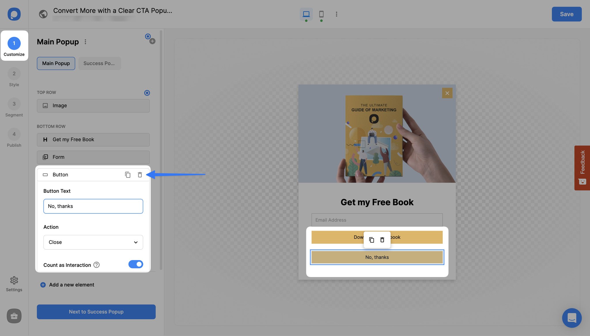
# Step 2: From "Customize", hover over the items listed on the left and click the edit symbol to either edit or delete it.
# In our case, we will delete the "No, thanks" option.
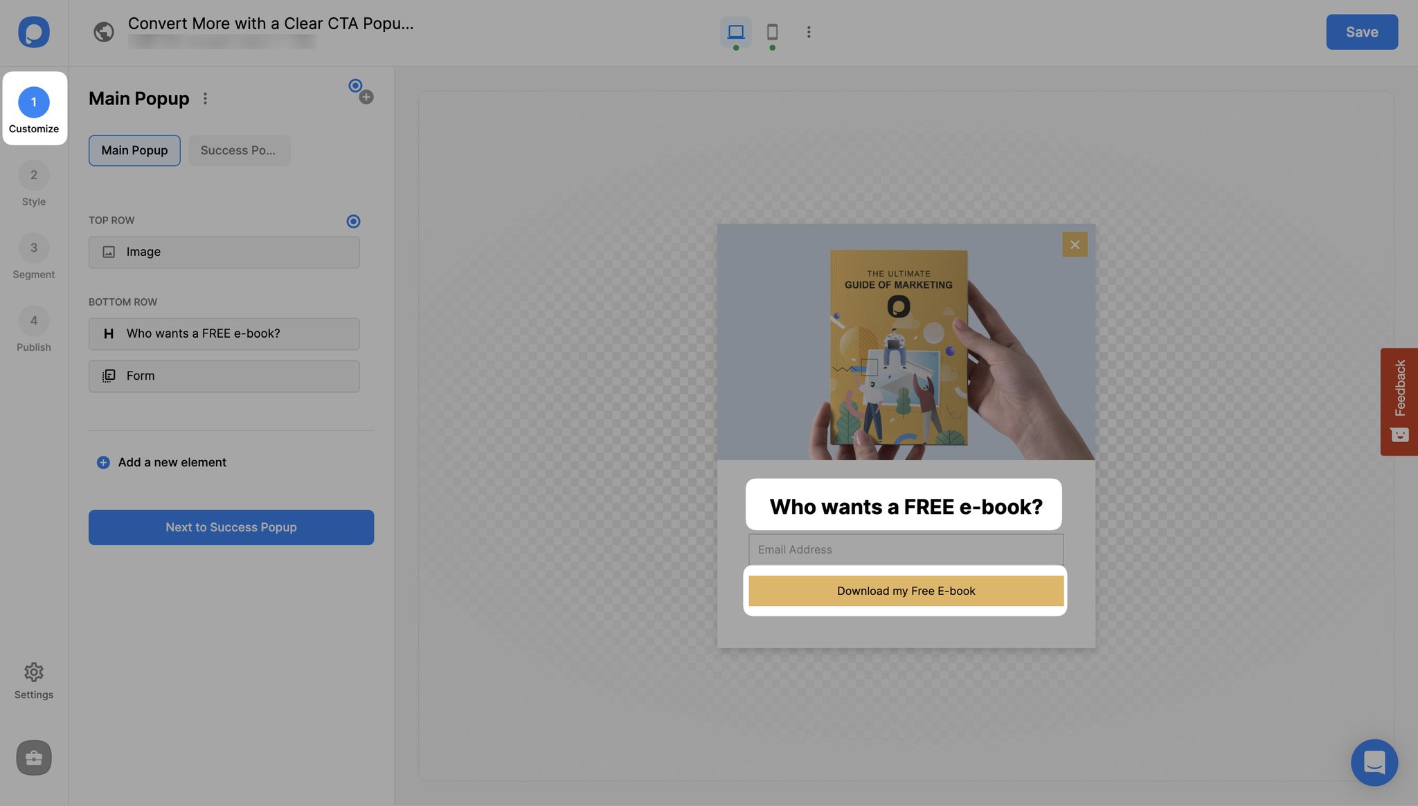
# Step 3: To increase your conversions, first, you should know how to create CTAs that actually cause action. Make it clear and compelling. You can avoid cliches and use "get" instead of "order" or "my" instead of "your".
For example, instead of using "Order Your E-book," choosing "Get My E-Book" would be more compelling to the customers.
You can include urgency to make use of FOMO and "free" (if so)
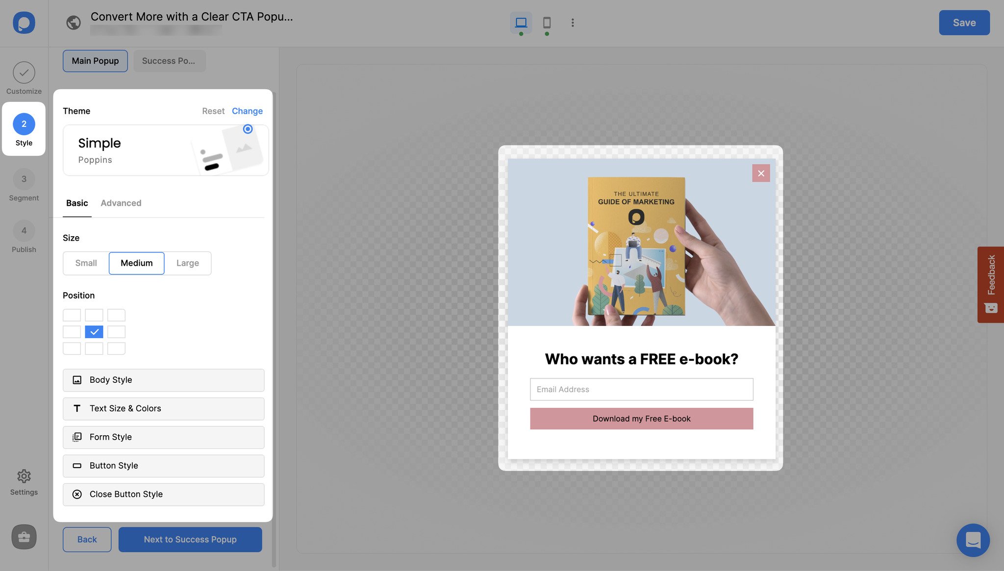
# Step 4: After deciding on your CTA (in this case, it is "Download my free e-book"), now it's time to make it stand out in the "Style" step. Active colors are more likely to catch the eye than passive colors. Also, they tend to evoke positive feelings.
You can use active colors for your popup's CTA button and a passive one for the "Not Now" button if you have one.
Another option is to color contrast the popup background for your CTA button.
As a contrasting color pops out from the background, more visitors can notice and take the desired action.
# Step 5: Once you think your popup is perfect with a conversion-ready CTA, you can save and publish it. To achieve the best conversion rates, you can test different CTA designs for your website.
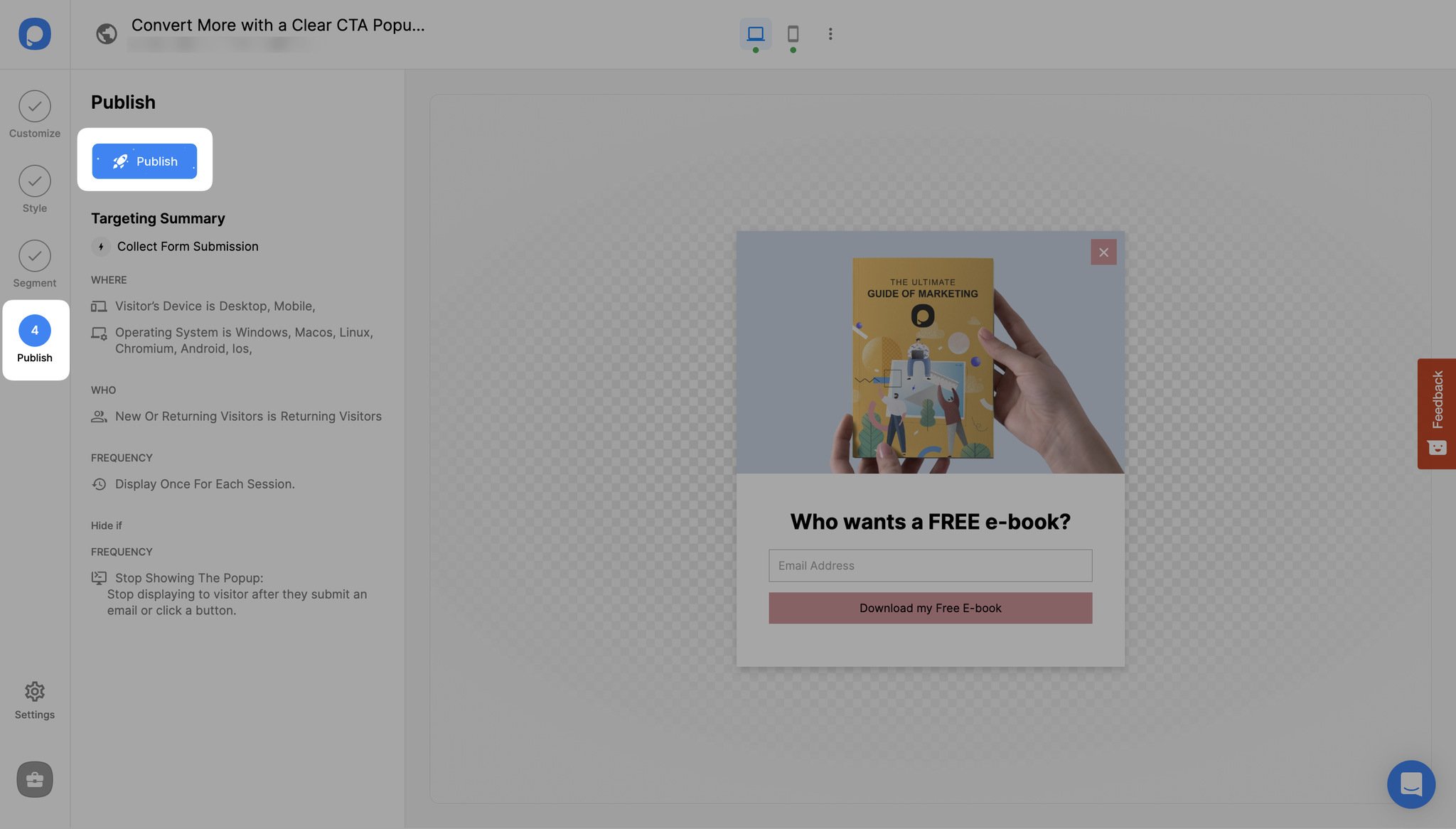
Well done! Now you have a clear and irresistible CTA popup that leads to more sales and conversions.
Remember to keep it simple and snappy using active language, compelling phrases, and eye-catching colors.
Don't be afraid to experiment with different designs and test what works best for your audience. So go ahead, put this recipe to the test, and watch your sales soar! Happy optimizing!
Need a hand? Contact Popupsmart!